Elizabeth!
Over the last few months I have been spending my nights taking care of my newly born second daughter. Keeping me company during the sleepless wee hours of the morning was the Reconcilable Differences Podcast. In episode 17 of this podcast, It's Devastating, there was an open question placed by John Siracusa with regard to how baby names change over time, and if there were any sudden changes. In this blog post, part of my investigation of podcast theme series, I will take a look at these two questions. I will also provide my source code in the spirit of reproducible research.
- Short a few apostles
- The names of the 1880s
- Name distribution
- Name change
- From the island to the wall
- In the end
Short a Few Apostles
I used the babynames package in R to perform this analysis. The R package babynames by Hadley Wickham provides a nifty way to get baby names and related information from the Social Security Administration and other government agencies. Downloading the data and plotting the name John relative to Jon over time can be done with a few simple commands.
library(ggplot2)
library(babynames)
library(dplyr)
library(magrittr)

# big plots, because I'm old and blind
theme_set(theme_gray(base_size = 18))

# get the names
theJNames <-babynames %>%
  filter(name %in% c('Jon','John') & sex == 'M')

# plot the proportion of new SSN applications
# with the names over time
p <- ggplot(data=theJNames, aes(x=year,y=prop)) +
  geom_line(aes(color=name),size=1.5) +
  labs(
    title='Jon v.s. John',
    y="Proportion of new SSN applications",
    x="Year")
plot(p)
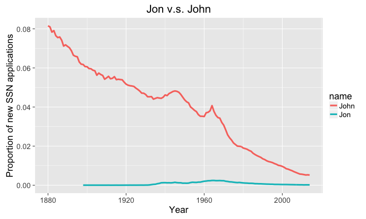
With this little bit of work, we can see that the proportion of babies named John is strictly larger than Jon, but is also on a fairly substantial decline. Out of curiosity, let's check James. Why James? It seems that just about everyone I know that is male and in their 70s is named James.
library(ggplot2)
library(babynames)
library(dplyr)
library(magrittr)

# big plots, because I'm old and blind
theme_set(theme_gray(base_size = 18))

# get the names
theJNames <-babynames %>%
  filter(name %in% c('James') & sex == 'M')

# plot the proportion of new SSN applications
# with the names over time
p <- ggplot(data=theJNames, aes(x=year,y=prop)) +
  geom_line() +
  labs(
    title='James',
    y="Proportion of new SSN applications",
    x="Year")

maxYear <- theJNames$year[which.max(theJNames$prop)]

plot(p)
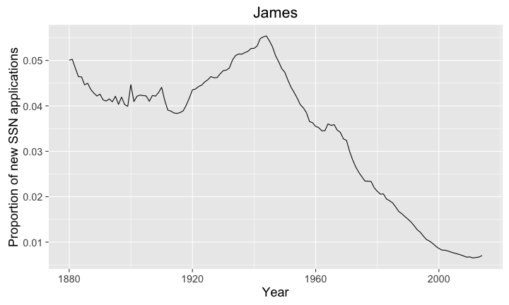
So it looks like we hit peak James in maxYear=1944. So this seems to line up with my observations.
For the data pedantic, which should be everyone, this list of baby names is derived from Social Security Card applications. Since the social security administration didn't exist until 1935 and didn't start issuing cards until 1937, the names from 1880-1937 are likely to be a bit incomplete.
The Names of the 1880s
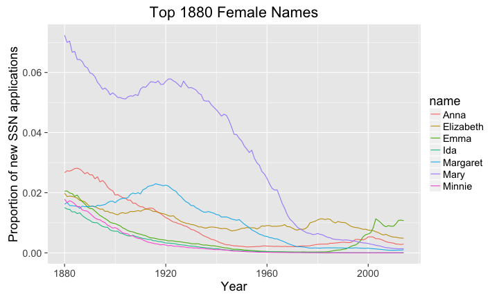
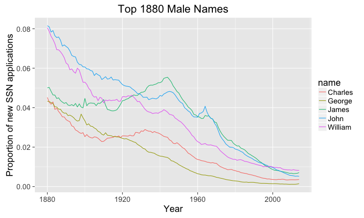
So John and James had downward trends in the coverage of new babies, does this hold for other names? Let's see what the top names in the 1880s are and where they are today, likewise let's see what the top names in 2014 are and how they have historically trended.
library(ggplot2)
library(babynames)
library(dplyr)
library(magrittr)

# big plots, because I'm old and blind
theme_set(theme_gray(base_size = 18))

# dream of the 1880s
# ladies first
oldNamesData <- babynames %>%
  filter(year == 1880 & sex =='F')

#baby names are presorted
oldNames <- head(oldNamesData$name,n=7)
oldNamesData <- filter(babynames, name %in% oldNames & sex == 'F')
oldNamesData$name <- as.factor(oldNamesData$name)

# plot the proportion of new SSN applications
# with the names over time
p <- ggplot(data=oldNamesData, aes(x=year,y=prop)) +
  geom_line(aes(color=name)) +
  labs(
    title='Top 1880 Female Names',
    y="Proportion of new SSN applications",
    x="Year")

maxYear <- theJNames$year[which.max(theJNames$prop)]

plot(p)
library(ggplot2)
library(babynames)
library(dplyr)
library(magrittr)

# big plots, because I'm old and blind
theme_set(theme_gray(base_size = 18))

# 2014 females
newNamesData <- babynames %>%
  filter(year == 2014 & sex =='F')

#baby names are presorted
newNames <- head(newNamesData$name,n=7)
newNamesData <- filter(babynames, name %in% newNames & sex == 'F')
newNamesData$name <- as.factor(newNamesData$name)

# plot the proportion of new SSN applications
# with the names over time
p <- ggplot(data=newNamesData, aes(x=year,y=prop)) +
  geom_line(aes(color=name)) +
  labs(
    title='Top 2014 Female Names',
    y="Proportion of new SSN applications",
    x="Year")

plot(p)

Now for the gents.
library(ggplot2)
library(babynames)
library(dplyr)
library(magrittr)

# big plots, because I'm old and blind
theme_set(theme_gray(base_size = 18))

# dream of the 1880s
oldNamesData <- babynames %>%
  filter(year == 1880 & sex =='M')

#baby names are presorted
oldNames <- head(oldNamesData$name,n=5)
oldNamesData <- filter(babynames, name %in% oldNames & sex == 'M')
oldNamesData$name <- as.factor(oldNamesData$name)

# plot the proportion of new SSN applications
# with the names over time
p <- ggplot(data=oldNamesData, aes(x=year,y=prop)) +
  geom_line(aes(color=name)) +
  labs(
    title='Top 1880 Male Names',
    y="Proportion of new SSN applications",
    x="Year")

maxYear <- theJNames$year[which.max(theJNames$prop)]

plot(p)
library(ggplot2)
library(babynames)
library(dplyr)
library(magrittr)

# big plots, because I'm old and blind
theme_set(theme_gray(base_size = 18))

# males in 2014
newNamesData <- babynames %>%
  filter(year == 2014 & sex =='M')

#baby names are presorted
newNames <- head(newNamesData$name,n=5)
newNamesData <- filter(babynames, name %in% newNames & sex == 'M')
newNamesData$name <- as.factor(newNamesData$name)

# plot the proportion of new SSN applications
# with the names over time
p <- ggplot(data=newNamesData, aes(x=year,y=prop)) +
  geom_line(aes(color=name)) +
  labs(
    title='Top 2014 Male Names',
    y="Proportion of new SSN applications",
    x="Year")

plot(p)

The interesting bit about both of these results is that the popularity of names seems to be fairly short lived in modern times. This can be seen in the popular names from 2014 poping up from nowhere, with the exception of William and maybe Emily.
Name Distribution
That was a lot of fun, but let's get back to the question of how people have labeled their children over time. What we can hypothesize from the prior results is that there is an abundance of new names over the last century.
So let's take a look at this new diversity in child naming. One way to look at this diversity is to just to plot the number of distinct names for each year and see how this changes over time (Figure 7.).
library(ggplot2)
library(babynames)


# big plots, because I'm old and blind
theme_set(theme_gray(base_size = 18))

# quick aggregation function, there is a dplyr function for this as well
uniqueNames <- aggregate(prop ~ year+sex, data=babynames,
                         function(x) length(x))

# plot the number of unique names from new SSN applications
# over time
p <- ggplot(data=uniqueNames, aes(x=year,y=prop)) +
  geom_line(aes(color=sex)) +
  labs(
    title='Number of Unique New Names over Time',
    y="Proportion of new SSN applications",
    x="Year")

plot(p)

Clearly this is an increase in distinct names. This increase in new names could be a function of the change in population size, but it is likely more complicated than that. Immigration from non-European countries may play a large roll in this change, but that would require a bit more work than I'm willing to put into this blog post.
Another way to look at this data is to plot the sorted proportions. Plotting the sorted proportions will provide some insights into the distribution of the names. If the proportions are uniformly distributed, this implies no real preference towards a particular name. If the proportions are highly skewed, then the population likely has a large number of uncommon names and a small number of popular names. To limit the number of plots, I just took a quick look at the plots of proportions for 1890 (YouTube) and 1990 (YouTube). To make things simple I just pooled male and female names together.
library(ggplot2)
library(babynames)
library(dplyr)
library(magrittr)

# big plots, because I'm old and blind
theme_set(theme_gray(base_size = 18))

# get names
namesDensity <- babynames %>% filter(year %in% c(1890,1990)) %>%
  group_by(sex,year) %>%
  mutate(index=1:length(prop)) %>%  # create an index
  ungroup(sex,year)

namesDensity$Year <- as.factor(namesDensity$year)

namesDensity1890 <- filter(namesDensity, Year==1890)
namesDensity1890 <-
  namesDensity1890[sort(namesDensity1890$prop, index.return=T)$ix,]

namesDensity1990 <- filter(namesDensity, Year==1990)
namesDensity1990 <-
  namesDensity1990[sort(namesDensity1990$prop, index.return=T)$ix,]

# plot the proportion of new SSN applications
# with the names over time
p <- ggplot(data=namesDensity1890, aes(x=index,y=prop)) +
  geom_line(aes(color=Year)) +
  labs(
    title='Plot of Decreasing Name Porportions in 1890',
    y="Proportion of new SSN applications",
    x="Number of Names")

plot(p)
p <- ggplot(data=namesDensity1990, aes(x=index,y=prop)) +
  geom_line(aes(color=Year)) +
  labs(
    title='Plot of Decreasing Name Porportions in 1990',
    y="Proportion of new SSN applications",
    x="Number of Names")

plot(p)
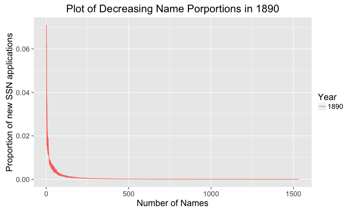

There are a few interesting characteristics about these two plots. The first characteristic we saw before in Figure 7., the number of the unique names. Here we can see the number of unique names increased eight times over one hundred years. So clearly there are more names out there, but how are they distributed? This can be seen clearly in both plots, there are a small number of common names and a much larger number of uncommon names. Finally, the magnitudes of these proportions are interesting, in 1890 the most popular names covered about 7% of the total population of new SSN applicants, while this was down to 3% in 1990.
Name Change
Were there any large changes in names over time? this is a bit more difficult question to answer, but let's have a go at it. What we need to do is to look at changes by a given lag, e.g. how do the names at time compare to names at tie where is a whole number.
Let's take a look at the change with , and use the mean squared difference between names. The mean squared difference is calculated as
library(ggplot2)
library(babynames)
library(dplyr)
library(magrittr)

# big plots, because I'm old and blind
theme_set(theme_gray(base_size = 18))

result <- c()
k <- 1

# get the change in proportion
for(t in 1880:(2014-k)) {

  # get the names at t
  currentName <-babynames %>% filter( sex=='M' & year==t)

  # get the names at t+k
  currentNamePlusK <-babynames %>% filter(sex=='M' & year==t+k)

  #join the two years together by name
  check <- left_join(currentName, currentNamePlusK, by=c("name"="name"))
  check[is.na(check)] <- 0

  result <- c( result, mean((check$prop.x - check$prop.y)^2) )
}

result <- cbind(1880:(2014-k),result)
result <-as.data.frame(result)
names(result) <- c('year','change')

# plot the proportion of new SSN applications
# with the names over time
p <- ggplot(data=result, aes(x=year,y=change)) +
  geom_line(size=1.5) +
  labs(
    title='Changes in Yearly Name Proportion',
    y="Mean of Squared Changes in Proportion",
    x="Year")
plot(p)
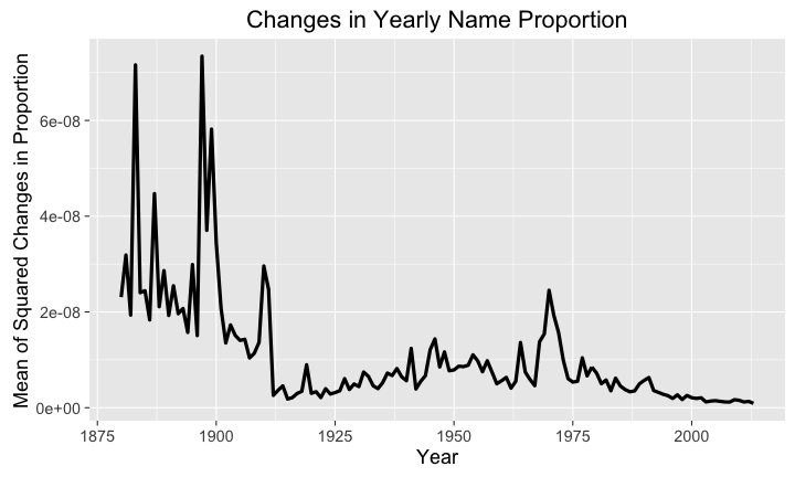
This plot is pretty interesting. We see some early on changes around 1890 and 1900, followed by a spike around 1910; then in close to 1970 we have another spike. My best guess would be the 1970 change would be associated with the black power movement that peaked in 1970, and the earlier changes are likely due to immigration events.
If we do a little bit of Google sleuthing we can see in this plot that there seems to be a bit of correlation between these early events and immigration, but not the massive spike in immigration that occurs in 1990. Looking at Wikipedia we can see that around the turn of the century there was a large amount of movement from northern, southern, and eastern Europe to the United States.
However, the massive spike in 1990 doesn't seem to be associated with a massive change in source countries, as seen in this plot. Of course this plot is of regions of birth, which I'll assume is a better indicator of future baby names than country of emigration. Still, as mentioned earlier, the names pre 1937 are a bit incomplete, so the earlier changes in name might be an anomaly in the data, and I certainly don't want to assume some degree of causal relationship.
From the island to the wall
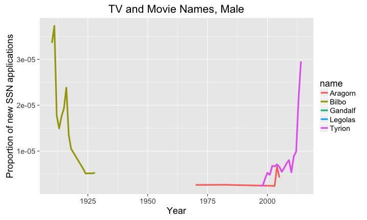
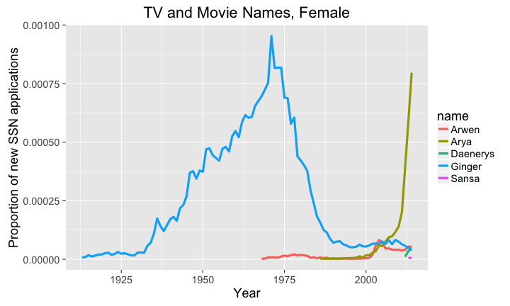
Just for fun, let's look at some popular TV and Movie names over time for males and females.library(ggplot2) library(babynames) library(dplyr) library(magrittr) # big plots, because I'm old and blind theme_set(theme_gray(base_size = 18)) # get the names tvNames <-babynames %>% filter(name %in% c('Bilbo', 'Aragorn', 'Gandalf', 'Boromir', 'Faramir', 'Legolas', 'Frodo', 'Gilligan', 'Tyrion' ) & sex == 'M') # plot the proportion of new SSN applications # with the names over time p <- ggplot(data=tvNames, aes(x=year,y=prop)) + geom_line(aes(color=name),size=1.5) + labs( title='TV and Movie Names, Male', y="Proportion of new SSN applications", x="Year") plot(p)
library(ggplot2)
library(babynames)
library(dplyr)
library(magrittr)

# big plots, because I'm old and blind
theme_set(theme_gray(base_size = 18))

# get the names
tvNames <-babynames %>%
  filter(name %in%
           c('Ginger',
             'Sansa',
             'Arya',
             'Daenerys',
             'Cersei',
             'Arwen'
             ) & sex == 'F')

# plot the proportion of new SSN applications
# with the names over time
p <- ggplot(data=tvNames, aes(x=year,y=prop)) +
  geom_line(aes(color=name),size=1.5) +
  labs(
    title='TV and Movie Names, Female',
    y="Proportion of new SSN applications",
    x="Year")
plot(p)
In the end
This was a lot of fun. Please let me know via Twitter or email if you would like to see anymore analysis. If I find some free time I would like to build an interactive website for this data, but in the mean time please feel to play around with the code I have provided.
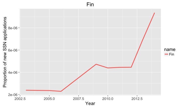
library(ggplot2)
library(babynames)
library(dplyr)
library(magrittr)

# big plots, because I'm old and blind
theme_set(theme_gray(base_size = 18))

# get the names
theJNames <-babynames %>%
  filter(name %in% c('Fin') & sex == 'M')

# plot the proportion of new SSN applications
# with the names over time
p <- ggplot(data=theJNames, aes(x=year,y=prop)) +
  geom_line(aes(color=name),size=1.5) +
  labs(
    title='Fin',
    y="Proportion of new SSN applications",
    x="Year")
plot(p)
As far as future work goes, I'll probaby take a look at the recent release of data on hard drive reliablility from Backblaze.


